Network Map
Concept
The map is a dynamic aggregated representation of all communications currently filtered.
It displays the network of nodes - servers and clients - and their links - communications.
It tries by itself to find a stable state to display all nodes.
You may however move and position all nodes as it best suits you.
The map uses various visual markers and variants to help getting an overview of the situation at a glimpse.
The map uses the ‘view options’ to simplify understanding.
The Network Map is available only on Network Capture views: PACK, TCP, HTTP...
Access
You may switch the top panel between Map and Dashboard from the top panel tabs.

Layout
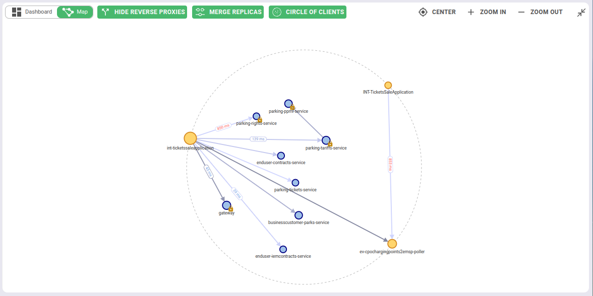
When there are too many nodes, the map gets crowded and slow.
It is best to filter to reduce the data set before displaying the map!
Nodes
- By default, one node is one IP address - see Grouping nodes to draw one node per Kubernetes workload instead
- Servers are blue
- Clients are yellow
- The bigger the node, the more data has been transmitted
- The more red the node, the more errors happened (client / server)
Links
- The arrow goes from client to server
- The stronger the arrow, the more data has been transmitted
- The link line is color split in proportion of success, client errors and server errors
- The average latency is displayed on the n slowest links, the more red, the slower.
Maps actions
Move nodes
- Nodes may be manually moved by drag and drop

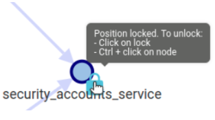
- Once moved, the node has its position ‘locked’ - only for the user
- A node may be unlocked by clicking on the yellow lock icon.
Pan & Zoom
- Map may be zoomed in / out by mouse scroll or with the map actions buttons
- Map may be moved by drag and drop anywhere in the map
- Map position and zoom may be reset to defaults

Filter
One of the most important action of the map is filtering
Clickon a link or a node filters the show only this node or linkCtrl + clickon a link or a node removes the target from the map
It allows, extremely fast, to focus on a service or a connection
Tooltips
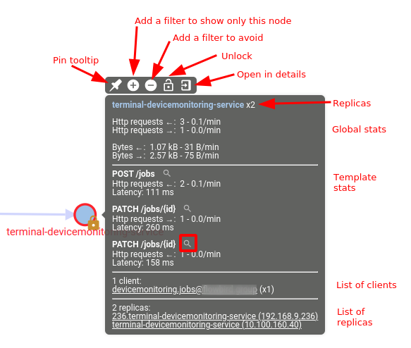
Tooltip contents
When moving the mouse over a node or a link, a tooltip appears after a while.
Its content:
- Globally and for most used templates:
- Count of requests and rate
- Count of clients & servers errors and rate
- In/Out data size statistics
Only for Node tooltips:
- List of clients
- List of replicas (when merging replicas)
Possible actions
The top icons allow to:
- Pin tooltip
- Filter Node/Link
- Unlock node
- Open in details
Many filtering actions are possible from the content.
They quickly allow to:
- Find and filter on APIs with errors
- Find and filter most used APIs
Grouping nodes
By default the map draws one node per IP address. In a Kubernetes cluster that is rarely the level you want to read: a service with twenty replicas is twenty nodes, and the same pod restarting under a new address looks like a new machine.
The Group by button changes what a node is.
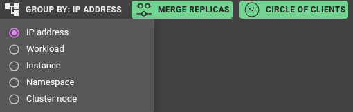
| Mode | One node per... | Node label |
|---|---|---|
IP address | address (the default) | the IP address, or its resolved name |
Workload | Kubernetes workload | namespace/name - e.g. spider-demo/storefront |
Instance | pod | namespace/pod-name |
Namespace | namespace | the namespace |
Cluster node | cluster node | the hostname |
Grouping applies to both endpoints of every communication, clients as well as servers.
An endpoint that resolves to no workload is not dropped - all of them are bucketed together into a
single Unresolved node, so the traffic stays on the map and the totals still add up.
Grouping reads the workload identity that Spider resolves for each address, which needs the cluster's
internal CIDR ranges to be configured (global.cluster.ipRanges).
Without them nothing resolves to a workload, and Workload, Instance, Namespace and Cluster node
all render exactly like IP address.
Reading a grouped map
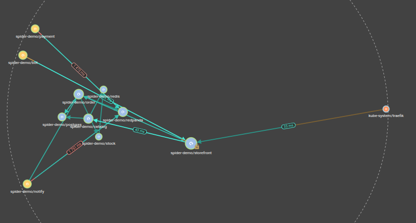
WorkloadandInstancenodes carry a small icon for their Kubernetes kind - deployment, statefulset, daemonset...- Nodes are clustered and coloured by namespace, so one namespace reads as one neighbourhood
Namespace,Cluster nodeandUnresolvednodes have no kind to show, so they carry no icon
Replicas of a grouped node
Hovering a grouped node appends a xN replica count to its label, and the tooltip lists the first five
addresses behind it.
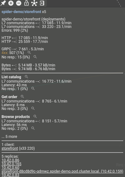
Open in details on a grouped node opens the multi-host detail view, with one tab per address.
Member addresses are resolved per traffic pair, up to a bound, and unioned across pairs - so a workload
seen from many pairs resolves more of them than one seen from a single pair. When more replicas exist than
were resolved, the tooltip says so: 137 replicas (showing 20):, the first number being the true distinct
total. Either way only the first five are listed; Open in details shows them all.
Jumping to the Network Usage map
On a Workload or Instance node that resolved, the tooltip action bar gains an icon that shows the same
workload on the Network Usage Cluster Map - the cluster-wide view of
who talks to whom, including traffic no Whisperer captured.
It appears only when the traffic on screen comes from a single controller that you have access to; with several controllers in view there is no single usage map to jump to.
The reverse trip exists too: a workload node on the Network Usage map offers Show captured traffic, which
selects that controller's Whisperers, moves to the HTTP view and filters it on the workload.
What is remembered
The grouping mode is kept per view, restored when you come back, and carried in share links and public links - whoever opens the link sees the map the way you left it.
Node positions you pinned are kept per mode: the layout you build in Workload mode is still there when
you come back to it, and does not disturb the one you built in IP address mode.
Settings
In the Main settings details, 3 settings have a direct effect on the map
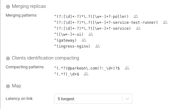
Merging pattern:
A regular expression to identify replicas of the same service.
Replicas are grouped by matching capture group.
Clients compacting pattern
A regular expression to shorten client labels.
Label is built by concatenating the matching groups.
Latency on link
Tells on how many links latency are displayed.
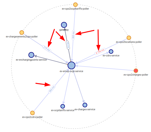
The links latency are the badges in the middle of the map links that display the average latency of the connexion.
| Option | Description |
|---|---|
| Don't display | No badge will be displayed. |
n longest | A badge will only be displayed on the longest / slowest links. This helps noticing the slowest! Usually, you don't mind the fastest. |
| Display on all arrows | A badge will be shown on all arrows. It may be a lot! |
View options

Hide Reverse Proxies
On HTTP view
Displays the origin of the call instead of the real source, by hiding the reverse proxies
Merge replicas
On all views, it merges replicas of the same server / service
Based on Merging pattern defined in settings, and applied to server FQDN
Both options are disabled while the map is grouped, and have no effect there.

A grouped map already keys the client side on the client's own workload rather than on a proxy origin, and
it already identifies a node by its workload rather than by a name pattern - so neither option has anything
left to do. Both work as described in IP address mode, and the
sequence diagram's own hide reverse proxies option is
unaffected in every mode.
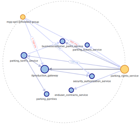
Circle of clients
It moves clients on the outside of all other nodes, for better understanding
Effects
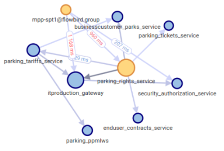
Without any options:
With all options:
Progressive loading
Map is loaded progressively by default, using pagination behind the scene.
This way, it loads smoothly even with massive data.

Progressive loading may be deactivated in the settings panel